Navigate quickly
My #1 Piece of Advice for Your Franchise’s Website

I was on a franchise sales consultation a few weeks ago, and I heard someone say something that I really, really liked:
“In franchising, you need to worry about your two most important pieces of real estate. Where your stores are and what your website looks like.”
While I certainly hope that your digital marketing team doesn’t report up to your VP of Real Estate, there’s something very powerful in treating your website with the same care that you use in deciding where your actual stores will go.
Of course, in franchising, there’s a fascinating issue with this idea. Site selection for your stores has been a core part of franchise development for decades. For many types of franchises, there’s a serious core competency wrapped up in scouting territory and striking leases. Yet, the whole “website thing” is fairly new for most employees at a franchisor.
And without a doubt, many of you retreat to working with an external expert on solving this issue. There’s a number of excellent website agencies out there, and I hope that you’ve found one that you have faith in.
That being said, you still need to realize what’s going on and help make the appropriate decisions for your company. Since we’re experts on the topic around here, I figured I’d pass along my #1 piece of advice.
ALWAYS display your main CTA on mobile
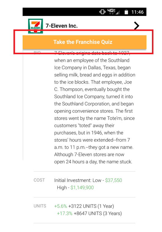
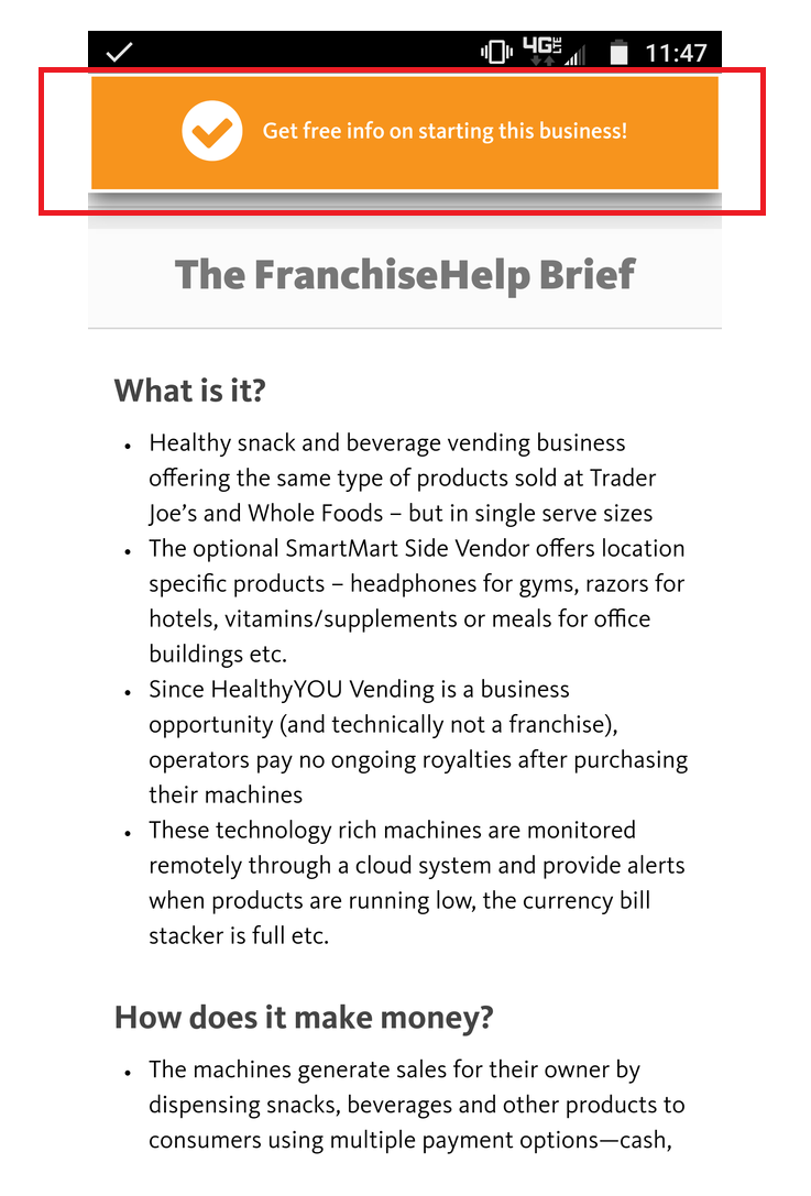
Before I get to why, here’s a couple examples of what I mean (you’ll want to visit these sites on your phone, so you can see the mobile experience) –
Entrepreneur - https://www.entrepreneur.com/franchises/7eleveninc/282052
FranchiseHelp - https://www.franchisehelp.com/franchises/healthyyou-vending/
Alright, let’s look at the three components:
Mobile
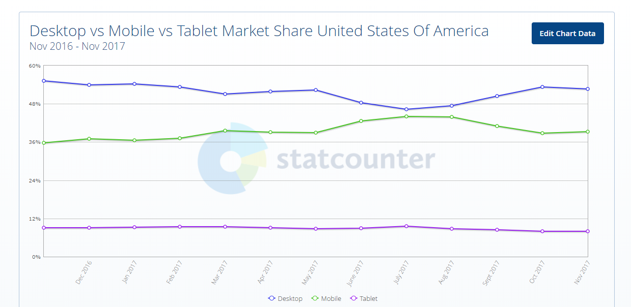
I said recently that I’m tired of looking at what websites look like on desktop. This is because A) designing on desktop is easy and B) the world is mobile. When you add up a combination of mobile and tablet, you see 60%+ usage on the web
If you’re not almost exclusively focusing on your site’s experience on the phone, you’re really doing your franchise a disservice.
Main CTA
There are many things that you can ask visitors to do. Call a number. Make a reservation. Create an account. Fill out a lead form. Etc. Etc. Etc.
When you’re on desktop, you can display many different options because the space available is large. You don’t have to chooses between the options above nor should you. But on mobile, that is not the case. What do you want people to do? What’s the thing that would make you the happiest if the person took that action?
This is not an obvious choice, but it’s an important one for you and your team to decide. Choose wisely because many, many people will do what you ask them to.
ALWAYS displayed
The previous two things don’t require too much engineering, while this one may. If you’ve gone to the lengths necessary to have a main CTA on mobile, then you’re almost there. That CTA needs to be present as users scroll down the page.
On desktop, once again as a comparator, users are far more likely to browse around. They’ll “dig” for the action they want to take. That is simply not the case for mobile. People won’t look very hard. So it’s paramount to your site’s success that, no matter where they are in the scroll, they have the ability to get to the CTA immediately.
So that’s it! ALWAYS display your main CTA on mobile.
Do that, and you’re well on your way to generating the leads that you need to fuel your franchise. And if you need additional help reaching your development goals, make sure you check us out at FranchiseHelp.
Eli Robinson is the COO of Metric Collective, the parent company of FranchiseHelp.

Ultimate franchising guide
All you need to know as a first time franchisee: Step by step guidance from experienced franchise professionals.