Navigate quickly
A Conversation About Franchise Landing Pages With FranchiseHelp's Experts
For those of you who are familiar with the Lead Generation Resource Center you know about the four steps of franchise lead generation. Today we're going to focus on step 2 or "Turning Visitors into Leads." Ultimately, the primary tool in your toolkit from an online perspective is landing page design. So today we'll focus on answering the question, "How do I make my franchise's website look good and, more importantly, work?"
We assembled two of the masterminds behind FranchiseHelp's web design to talk about what they've learned designing a site that attracts more than 500,000 unique visitors a month.
Eli Robinson (GM of FranchiseHelp): Tim and Eric, why don't you introduce yourselves and tell us why we should listen to you speak about landing pages?
Tim Gilboy (Marketing at FranchiseHelp): Between the two of us Eric & I handle most of the marketing (both off-site and on-site) for FranchiseHelp. We've designed landing pages for various parts of FranchiseHelp as well as for other sites and most recently we've been working on redesigning the franchisor landing page at FranchiseHelp.
Eric Robinson (Marketing at FranchiseHelp): Thanks, Eli! As Tim mentioned, we obsess over the design and experience of landing pages on a daily basis and have optimized dozens of landing pages to multiple different goals. We’ve seen a fair amount of success for most of our goals, and we have a lot of proven experience in testing different landing page techniques and figuring out how different design elements can work together
Eli: Well welcome guys. Eric, I want to dive right into something you just said. "We've seen a fair amount of success for most of our goals." For everyone out there who's intimidated by this whole process, what does it mean to be successful in landing pages?
Tim: Wait. Wait. Wait. I think first we should probably define exactly what we mean by "landing pages."
Personally, I've seen a few different uses of it out there, but what I typically mean by it is any page where a user would first come to your site. Eric do you agree?
Eric: I agree. A landing page is a portion of your site dedicated to be a visitor’s first impression of what your site has to offer. Usually it’s a page a visitor ends up on after being referred to your site by organic search, an affiliate or through some other form of paid traffic.
Back to your question about “success,” that will have a different answer for every web page. Success is ultimately whatever action you want a visitor to take. It can range from providing contact information to placing an order to reading an article.
Tim: Definitely. Across FranchiseHelp's landing pages we probably have at least 4 or 5 different goals that we would use to measure whether a page has been successful, from having some give us their email address to selecting a franchise, to downloading a report.
Eli: Seems that this can get convoluted quickly, so let's get concrete. Let's assume that you have a landing page whose sole goal in to get someone to fill out a contact form. Eric, if this was the goal, how would you determine if you're successful?
Eric: This one is easy: success is when a visitor fills out that form in its entirety.
Eli: Touche!
Eric: The “failure” (although that’s a harsh word) is when a visitor sees the page and closes the window without further interacting with that site.
Eli: Right, so you're talking about success and failure in an isolated user's case. So let me ask this another way, and Tim you get involved here. How do you know if your current landing page is successful?
Tim: Oof that's a little bit of a trickier task. I really think that you never get to a point where a landing page is perfect and there are always changes you can make to be more successful. But to determine just whether you're successful or not is hard. I generally try to set a target % of people who come to the site who submit their contact info and if I'm getting at least that percentage than I'd say the page is successful.
Eli: The old "conversion rate."
Tim: Haha indeed. However to be clear, I don't think there's really a cut and dry answer to “How do you know if your current landing page is successful?” It really depends on what you're trying to do.
Eli: We'll come back to making an existing landing page better, but for now let's focus on starting from scratch. I want to design a landing page with the goal of getting people to fill out a contact form. What's the first thing I should do?
Eric: The first think you’ll need to do is decide what information you’re trying to gather. In general, people on the internet are reluctant to give out personal information, so ask for as little as possible while still being able to achieve your goal. If someone completes a form and you’re only going to send them a postcard, then don’t bother asking for their phone number.
Eli: So we start with the contact form, ok. In general, more fields or fewer?
Tim: In general fewer - but make sure you capture enough to get what you want out of it. I would usually recommend name, phone #, and email.
Eli: Any examples of good vs. bad contact forms?
Eric:Good form --
Bad form --
Eric: People on the Internet are surprisingly less patient than people in real life. The more distractions and tasks you give them to reach your desired goal, the less likely they are to complete it, even though it may be in their best interest.
Tim: It makes sense though. If you take too long to give them what they want they can go somewhere else in a heartbeat. And that's exactly what happens if your contact forms are a pain to fill out.
Eric: A good practice is to remove every field from your contact form until the information you capture is unusable. A good example is a Mr./Mrs. Field. Will the form work without that field? Yes. So it’s totally unnecessary.
Eli: Alrighty. Step 1 Complete. We've decided what our contact form should look like. The way I see it, I'm no closer to actually having a landing page. What's the first step in actually making one?
Tim: Start designing it! There are a bunch of awesome services out there that make it very easy for you to start creating your own landing pages from scratch. Or if you're a bit more technically skilled you can do it on your own. I'm definitely the former so I tend to use something like Unbounce to mock up (and sometimes host) my landing pages. There are tons of templates out there to give you an idea of how to create a visually appealing landing page if you're not incredibly creative.
Or you could just be Eric…
Eric: Aw Tim, you’re making me blush.
If you don’t want to use one of the countless great services out there on the web, then I would start with determining a layout. Figure out where you want to have your Call To Action (CTA, the place the user completes whatever your goal is) and where you’re going to have your supporting information. The CTA should hold the focus of the page, but you need to have some space in the layout to actually provide value to your visitor.
Get out some paper and draw some boxes. We call this a wireframe. Here’s an example:
One practice that Google employees use when designing a landing page is the “ten foot rule." If you stand ten feet away from your computer and can’t see the CTA then it isn’t prominent enough.
Eli: Now we're cooking. We have ourselves a design. I like Tim's idea of hiring someone to do this. (Alas, life would be easier if we were all Eric.) Quickly, what actual format is a website design delivered in? Is it a PDF?
Eric: There are usually two deliveries: a flat document such as a PDF, and a layered document such as a Photoshop file (.psd). The flat document is the virtual version of a sheet of paper, it’s as the website appears in your browser. The layered document contains all of the individual icons, pictures, blocks of text that will make up the site. Layered is similar to the individual pieces of a collage. Take both of those documents and create the webpage in HTML format. Or, if you’re similar to 99.99% of the population, you’ll need to hire a developer to turn your document into code.
Eli:I'm sure everyone reading this is shuddering at the thought of needing a "tech guy" to help with this, but it's an important point. You're only going to be able to have the landing pages you want when you have a technical person (perhaps outsourced) who can turn a Photoshop file into a website.
Let's recap where we are now because we're about to get into optimization (which I know you two are going to argue is the more important part anyway.) We...
- Set a goal
- Focused on the CTA (in this case filling out a contact form)
- Designed a webpage either using a service like Unbounce or a designer
- Took the PDF / Photoshop file and used a software programmer to put it on
the web

One more question before we get to optimization. What role, if any, does the mobile experience play here? Is it ok if my page only looks good on a desktop?
Eric: That's a hard no.
Tim: Take a look at these two landing pages --
Desktop:
Mobile:
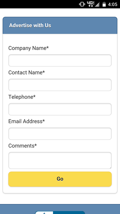
On desktop it's ok. Some people would probably submit on it. On mobile? No way. It's just a contact form. No explanation of why I would give you my name, email address, phone number, etc.
We talked earlier about how people are impatient on the internet. They're also incredibly untrusting.
Eric: I’ll even go as far as to say that it’s the exact opposite of your question, Eli. It’s ok to have a mobile-only page, but never ok to have a desktop-only page. An axiom of modern web design is “mobile first."
Eli: Phew. Glad we got that out of the way. Sounds like you two have a special place in your heart for desktop-only landing pages.
Onto optimization. We started off this conversation saying that successful landing pages are those that get people to fill out a contact form. Now that our brand spanking new landing page has hit the web. How do we get that conversion rate to go up?
Tim: Test.
Test.
And test some more.
Try different images running in different versions and see which performs better. If there's information that you don't absolutely need to collect then try removing that from your contact form and see if that performs better. Try different calls to action. Over time you'll build up an idea of what gets your users to submit their info and what doesn't. You might wind up being surprised by the results too. Maybe you'll find that your users don't want exactly what you thought from your first design, but instead want something a little simpler.
Eric: I 100% agree with Tim, you need to test and take the little wins. I like to think that there are two areas in which you can test your site: adding value and grabbing attention.
For example, putting an arrow on your page that attracts the user’s eye to the form will increase conversion by directing attention, but it doesn’t add much value to your page. For example --
One with arrows:
And one without:
But testing different lines of copy text can increase conversion rate by providing different levels of value to your page without grabbing extra attention. For example --
Here's one version:
And here's another:
Both of these need to be tested in their own right.
BUT! Unless you have some experience in multi-variate statistical analysis, do not test multiple changes at the same time!
Tim: Definitely! You want to be sure you fully understand what is making people react differently to your landing page, and making too many changes at a time kills any chance you have to do that.
Eli: Testing can be a difficult topic to understand in the abstract. We've run so many landing page tests here at FranchiseHelp that I don't have the time to count them. However, we've written about a few of our favorite. You can find them here:
- What is Split (A/B) Testing?
- An A/B Test That Shows the Value of Color
- A Split Test That Shows The Power of One Word
- My Ideal A/B Test (That I Can’t Run But You Can)
Let's turn this conversation to franchise lead generation specifically. As you guys think about getting someone to give you their contact information in order to learn more about opening a franchise, what specific things come to mind that relate to landing page design?
Tim: Show them value early and often. As I said earlier people are fairly suspicious online and you need to give them a reason to trust you before they'll give you their contact info. Whether it's information on the advantages of being a franchisee or a step by step tutorial about how to secure an SBA loan for opening a franchise. a piece of content on the landing page that gives the user a valuable experience in exchange for contact info will help incredibly.
Eric: In addition to showing value, franchisors will need to display credibility and provide a clear, concise message. Providing tutorials, as Tim said, can provide credibility, or examples of successful franchisees.
Tim: Credibility can also come from testimonials from current franchisees. However, you do want to be wary to not overcrowd your page with information and distract from the key part of the page, the contact form.
Eli:I want to have a bit of tact when I ask for this, but can you give an example of some good and bad landing pages are far as building credibility?
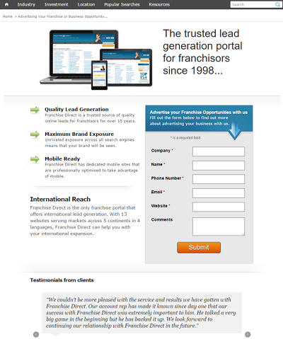
Tim: Here's an example of a landing page that isn't terrible but could use some improvement --
Eric: Based on what we’ve spoken about so far, here are the things I think they can improve –
- There are far too many form fields in the contact form
- The images at the top of the page don’t seem to add any value nor get a user closer to conversion
- It’s not immediately clear what the user is supposed to do
- If you stand ten feet away from the page, there’d be far too much text to know the CTA
Eli:Thanks guys. Very insightful. Hopefully our readers can find some inspiration in the feedback that y'all have given.
It's time that we move onto everyone's favorite segment, THE LIGHTNING ROUND!
Eric: BRING IT!
Eli: I throw out a prompt, you must respond "Yea" or "Nay" and a brief explanation. Of course, if anyone is interested in a further explanation they’re welcome to ask us a question here.
Designing a franchise landing page specifically with a tablet experience in mind ==> Yea or Nay?
Eric: Yea! But this is an answer by default because you should always design for mobile first, and a mobile design will work on a tablet.
Tim: Nay - Tablet specifically is not nearly as important as mobile specific right now. If you can only focus on desktop, tablet, or mobile, go for mobile.
Using a SAAS product (like Leadpages) to design and host landing pages for you rather than doing it all yourself ==> Yea or Nay?
Tim: Yea - It's a useful way to test out ideas for a landing page and to design them without a ton of resources. However, it is a short term solution and in the long run you need to build out the solutions fully on your own site.
Eric: Nay - Designing your own franchise landing page gives you more flexibility than working within the constraints of a SAAS product, and it’s important to create a relationship with a dependable developer for the overall health of your online presence.
Tim: Are we going to agree on any of these?
Stealing copy from another franchise's landing page you like instead of writing your own ==> Yea or Nay?
Tim: Nay - Google (and other search engines) hate duplicate content. In the long run it won't help you.
Eric: Nay - I agree with the SEO reasons Tim mentioned above, and you also want to be creating your online brand, not chasing the tail of your competitors.
And finally...designing your page specifically with SEO in mind ==> Yea or Nay?
Tim: NO - SEO is a decision for later in the game. Use other sources to get users to come to your site as your first testing out. Maybe after you've optimized your page for conversion you can start to consider SEO optimization. #SEOISDUMB
Eric: Nay - Focus on conversions first. SEO is too competitive of a game, extremely difficult to track, and won’t drive leads when you’re first starting out.
Eli: To wrap this jawn up, let's conclude (as we always do) with a mad lib: By far the most important choice you have to make when making a good landing page is __.
Tim: What contact info you want to collect
Eric: Where to put the CTA
Ultimate franchising guide
All you need to know as a first time franchisee: Step by step guidance from experienced franchise professionals.